Thursday, December 8, 2011

Week 14 Visual Techniques

List:
Instability
Asymentry
Iregularity
Fragmentation
Intricacy
Exaggeration
Spontaneity
Activeness
Boldness
Opacity
Variation
Accuracy
Depth
Justaposition
Randomness
Sharpness
List:
Balance
Symmetery
Ireggularity
Unity
Exaggeration
Stasis
Opacity
Accuracy
Flatness
Sharpness
Reptition

The first example is by a graffiti artist called Daim. Daim is known for manipulating a 2D canvas with 3D art. His play on the depth perception is phenomenon. The style he uses is called Wild Style by other graffiti artists. The reason that his art drew me into aiming to be a designer is due to the second example. In the second example, a gaint kit kat bar image was recreated on a bench. It's this kind of creative thinking in advertising that I want to be a designer. But I also want to be able to manipulate the depth perception so much, like Daim, for advertisements. In my perspective, it is like playing pranks on people's mind but you get paid to do so and it looks fun.

Week 13 - Contrast

Example 1-Successive USE of contrast

In this example, we can tell that there is a head/body figure. We can also see 2 human-like hand figure. The reason why this poster is successful in the use of contrast is because they used the colors black and white. Black and white are very high contrasting colors and they were used to create the illusion of depth by imitating the illusion of the white hands overlaying the black figure. Although the pink/red fingernails do not contrast very well with white because they are both very bright colors, the fingernails were placed at areas that connect to both the white and black areas. Because it is placed in such areas, we can easily tell it apart from the black and then giving it full recolonization as fingernails. Another great use of contrast is the fact that the main title is in red which grabs attention. The contrast in scale also gives importance to the poster. The first thing that grabs your attention is this figure being eloped by a pair of white hands. This is because it is the largest object on the poster in contrast to the rest of the items on this poster. The next thing we notice is the main title of the poster, which is written in fairly large red letters compared to the rest of the text on this poster. The small and grey letters are the least attention receiving item on the poster. The reason is because grey does not contrast well with black, making it hard to read and this is intended by the design because they want to draw your attention to the title and actor names but not the sponsor and producers of the movie. Also the text is scaled to be very small so that it does not steal attention away from the rest of the poster, which is also intended by the designer.

Example 2: Poor USE of contrast

This is an example of a poor use of contrast. The reason why it is a poor use of contrast is because the text "The First Avenger Captain America" is hard to read. The main reason that contributes to this failure is because of the font. The font is not bold enough or large enough to be read clearly. On top of that, the majority of this poster is very mono with high contrasting whites and blacks. The placement of the text is in an area that is mixture of both making it hard to read because the text either balances with one color but contrasts with another. This creates a slight confusion as part of the text almost becomes invisible because of it's harmony with the darker colors.

Week 12 - Implied Motion

Example 1 - Beijing 2008 Olympics Logo

In this example, we are focusing at the red figure. In the red figure we can see 2 things, the first is a stick figure and the second is what resembles a chinese character. For the purpose of this assignment we are going to focus on the stick figure. The stick figure is interpreted as moving/in-motion. The reason we see that it's in motion is because the figure is not standing still with arms to the side. If we look at what is recognized as legs, we can tell that one leg is pulled back and one leg appears to be pushed out. This kind of composition for the human body is recognized as a person's legs in the motion of running. Now if we focus at the arms of the stick figure, they are stretched out. To put it all together, this person has arms stretched out and legs that are recognized as running. With previous knowledge that this is a logo for the Olympics, we can interpret that the stick figure either just won an trophy or is running across the finishing line. These are the 2 common scenario which we see the same type of motion presented here in the logo with the stick figure.

http://www.psy.ritsumei.ac.jp/~akitaoka/loreal2006e.html
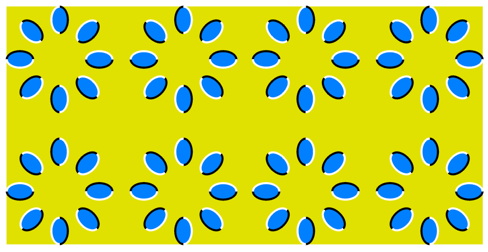
Example 2: "Brownian motion"

If you focus on this example, you can see the blue particles moving in circular directions. The reason that they are moving is because of the high contrast in colors. Because the colors are in contrast and that each particle is bordered with half white and half black, our eyes keep switching between specific cones that creates this illusion of motion. If we look carefully, we can see that the image is actually still. However, if we keep moving our heads/focus point for our eyes we can see the motion again and watch the particles turn. The reason is because each time we move our focus point, the contrast creates another illusion. So as long as we keep moving moving our focus point, the particles will continue to move as our eyes adjust to the static image.

Week 11 Dimension/Space/Depth/Scale

This is a digital graffiti piece created by Daim. In this piece you can clearly see the use of depth from the way the shapes and arrows scale larger from the center to the edges of the canvas. To demonstrate this, we can look at one of the arrows, you can see that as it scales towards the bottom of the canvas (in this example, the orange arrow with a white arrow inside it) appears as if it's scaled larger as it heads toward the bottom of the canvas. The use of shadows and highlightsre-creates/imitates the third dimension. However, not only are the shadow and highlights illustrating dimension, but also because you can clearly see that this piece is drawn in relations to multiple perspective points which also gives the illusion of dimension on a 2D canvas. Also the contrast between the blue background at the bottom and the grey at the top creates a sense of a wall vs the floor. The grey a fore mentioned is the wall and with a lot white space, it gives the piece empty space compared to the very detailed/filled space in the center of the canvas.

Monday, December 5, 2011

Week 10 Tone and Color

a. Tone was used to show the pureness of the skin the model had. The shadows and darker side of the tonal range was dedicated towards the background for the composition of this photograph. Also the dark grey tones on her face in this composition brings out the whiteness in her eyes, giving it a more complicated look.
b.Tone is used to isolate the model from the background. This gives the photograph more depth, so tone is working with dimensions. The head of the model appears closer to the surface or audience because the darker background is drawn back due it being darker in comparison to her very light/white skin. This contrast in tones creates depth, giving it a sense of dimension.


b. Color is lacking in this photograph so except for the picture of the product. This way the colored product is a large focal point despite it's scaled proportion to the rest of the poster.
b. Color works with the element of size in this poster. Even though the picture of the product is small compared to the rest of the poster, it retains a large focal point because it draws so much attention from the black and white. Especially because pink is a hot color, it really highlights the product and draws even more attention.

Thursday, October 27, 2011

Week 9 - The Basic Elements


Elements: Lines
Lines are used here in this poster in the form of vectors. The lines are used to create shapes in vector form, from connecting multiple dots together. The lines in each shape also give direction of the overall composure that their all flying upwards. Only a few of the lines suggest that the object is falling back down, which is usually shown on the side of the objects.


Elements: Dots
This is a 3D render created on the computer based on the concept of using pixels or dots to create images without lines. This is called pixel art. The artist placed the pixels next to each other carefully to re-create the character kirby from nintendo. However, this is a play on the elements as dots are on a 2d plane but this is rendered in 3D plane.


Elements: Scale
This is a photograph representing scale. The hand is closer to the camera than the man standing on the rock. When the man is further away, he is scaled down. The hand is placed so that he looks like the man is being held between the thumb and forefinger due to scale. There isn't much more to explain except that it's awesome. To be able to manipulate scales/size through distance and perspective manipulation.

Thursday, October 6, 2011

Week 6: Top-Down

I looked at this photo and I instant recognized two males at a gas station. One male is pumping gas into his car and the other is literally pumping gas. When I look around what was perceived as a man behind the gas station pumping out gas was actually just an advertisement poster. The poster was cleverly designed so that we fixate on this irregularity and then from our constant eye movements to gain more information, we see the smaller orange box with what the advertisement is saying in text form. I picked this image because I want to work in the advertising field from the visual side of designs and this was a really clever idea. Also the way that the person is cramped in the advertisement has the dimensions match what we would think is the inside of the gas station thingy. Since most of use don't actually know what's inside it, this is a great way to captivate user attention.

Photo from: http://www.usernetsite.com/advertisement/funny-print-advertisements.php